Wednesday, September 30, 2009

Color Throwdown Challenge #62

Well, today is the day...my last day as the Color Throwdown Team's September Guest Designer :( I have to say, this was SO much fun! I'm still VERY humbled that they selected me, and super excited that I was able to create alongside such talented designers! These ladies are top-notch in my book! LOVED this month with them! Thank you again, ladies :O)

Today's awesome challenge colors were selected by Ms. Broni! Aren't they great?

Our sponsor this week is Louby Loo. I was so lucky to be able to sample their Wilma the Witch and Spooktacular Sentiment for my card! Isn't she the CUTEST?! The sentiment actually came to me with black font and border...I decided to change it up. I found the Razzleberry graphic on Stampin Up and picked up the color in my image editing program, GIMP. I used it to recolor the background and I changed the font and border to white. I like it girly...remember?


I used the watercoloring with markers technique on my image. I added glitter to the band on her hat and stickles to her shoes...though it's hard to tell in the photo. Oh, and can you see the eye shadow I added to Wilma and her pet spider? Cute, ehh? I hand stitched the panels in three different styles and used a LOT of dimensionals! Again... :O) I think the rest is pretty self explanatory.

Be sure to check out the rest of the team's amazing creations! They are SURE to inspire you :O)


Don't forget to upload your creation to Mr. Linky on the CTD blog and use keyword CTD62 if you upload to an online gallery! Can't wait to see what you come up with!

I'll end with saying it truly has been my pleasure designing for the Color Throwdown this month! I'll be playing along each week on the CTD blog, so I won't be far :) Thanks for supporting me over the past five weeks! It means so much to me!

Happy Wednesday!

Monday, September 28, 2009

Very Tweet Thank You

***UPDATE***
Shortly after I posted this, I found Dawn McVey's Raspberry Color Suite Challenge #17 had the SAME exact colors! So, I posted it on her blog as well. How odd that the palette was identical! I never luck out like that :O)

So, my intent with this card was to submit it for a publication call...which I did last night. 8 minutes after the deadline :( I doubt it's eligible for the call, so I'm sharing :)

I'm stocking up on some thank you cards and this is the first of several. A few weeks ago I hit a GINORMOUS clearance sale at Michaels. I found a TON of rub ons for like 26 cents. I stocked up and even shared some :O) I love the vibrant colors...especially on this particular image.

If you know anything about me in this paper crafting world, you know I don't own a sewing machine, nor do I know how to use one. Tragedy...I know. I am left to hand stitching EVERYTHING. I've been wanting to stitch more and more frequently recently. I usually use craft thread (i.e. embroidery thread) but I wanted something more delicate on this project so I used regular old sewing thread! I love how it looks though! Just the thought I had in mind :O)

That's it for now. Be sure to check back on Wednesday for my last (*tear*) Color Throwdown challenge as their September guest designer!

Oh and have you heard? Most of you know that Pink Cat Studios released a new line of digital images, right? Welllll....Melissa is now looking for a digital stamp design team! You can read about the application process HERE.

Have a great week! Mine starts tomorrow...

Sunday, September 27, 2009

MOJO Monday Challenge

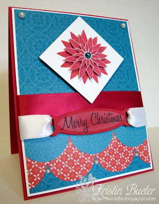
I was finally able to play along with one of my beloved challenges...MOJO Monday. It has been a WHILE! I thought the sketch this week (MOJO105) provided a great layout to use my new Papertrey Ink, Peaceful Poinsettia set.

MOJO105 Sketch


My Card

I stamped the poinsettia three times in Pure Poppy ink. Oh, and I have to tell you, I realized again while stamping the poinsettia multiple times that quality cardstock makes ALL the difference in the world!

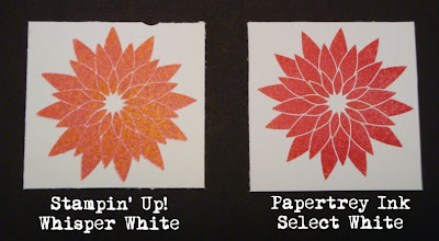
I first stamped it on Stampin' Up! Whisper White, but this cardstock has a smoother texture and doesn't "grab" the stamp as easily. This causes the stamp to slide just a little bit, which gives the image a fuzzy appearance. Switch over to the AMAZING Papertrey Ink white cardstock and experience a 180 degree difference! It immediately grabs the stamp and results in a crystal clear image...the way the stamped image is supposed to look. Keep in mind, I'm using a very steady hand on both attempts. In fact, I repeatedly attempted to use SU! cs and had the same result.

Here's an example of the two images stamped on the different cardstock: Awesome, right?!

Stampin' Up! vs Papertrey Ink Cardstock

The color even photographs better using the PTI cardstock. I didn't realize that until I did this comparison. Mind you (and my SU! Demo friends) I don't think SU! cs is all bad...it's just not my favorite for filled images (vs the outlined images).

Okay...back to my poinsettia. After I stamped it three times, I cute one layer using Nestabilities Large Square dies, and cut out the medium and small layers of the poinsettia on the other two. I layered it using dimensionals (pay close attention to lining up the layers...they differ a little bit on each point), and added a pearl rhinestone that matches my patterned paper.

Close Up of Poinsettia

I punched 1 1/2" circles to create my scalloped layers and added red satin ribbon. I cut the tag die and sponged Fresh Snow ink around the edges before removing it. I then stamped the sentiment using Memento, Tuxedo Black ink. I decided to keep the sentiment simple with white satin ribbon and no bows! Soooo unlike me...I love a great bow on a card...it usually adds so much. But, I thought "less is more" on this card...in an effort to keep it elegant.

Close Up of Sentiment and Rhinestone Pearls

I added some more rhinestone pearls between the scalloped circles...though it's hard to tell because they kind of get lost in the patterned paper. I still think they suit the overall card :O)

Okay, that's it for now. Thanks for stopping by! Have a great week :]

Saturday, September 26, 2009

My Timeless Template Challenge...#6

Ahh...the week is finally over - let the weekend begin! I'm getting mine started with a My Timeless Template Challenge (MTTC06) by Lauren Meader. Today's challenge is to use one of her Timeless Templates from Papertrey Ink to create your own packaging for candy!

I chose to use the Get A Handle On It template for my package. I know this is the "Halloween ghouls and goblins" time of year, but I've never been a fan of the typical Halloween themed cards or projects. So, I decided to make a package that suits my taste and add Halloween colored candy to it :O) LOL...I have issues, I know! My vision (probably based on the challenge graphic) was to create a package suitable for gourmet candy. While I didn't use gourmet candy to fill my box, I think the box is pretty enough to house some :] I used two of the candy wrapper colors in my package as inspiration for my project colors, and completely ignored the other two!

Okay, so once I made this fancy bow out of some dual colored ribbon I had on hand that matched perfectly, I decided I didn't want any other embellishments. Not even a tag! Though it probably should have a tag! Here's a shot of the empty box with and without the ribbon:


As you can see, I made a clear box with a simple base and added a matching lid. Please note, I made the lid on my own...this didn't come with the template design. To make the striped base, I used PTI's Lavender Moon and Plum Pudding cs. I cut 2 pieces of the Plum Pudding cs to about 1 1/2" x 7 1/8". To make the stripes I used the SU! Word Window Punch on the Lavender Moon. I ran the punched pieces through my sticker maker and adhered to the folded cs. I then cut the top and bottom of the cs to 3/4" x 7 1/8" (to trim the rounded edges). I added a black piece of cs (1" x 7 1/8") and the Plum Pudding cs (1 1/4" x 7 1/8"). Here's a shot of the box with the lid off. I lightened the photo to try and show the black scalloped oval on the handle. I love that little touch!


For the lid, I stamped medium sized dots from PTI's Polka Dot Basics set using VersMark ink. I think I started the lid at 5 1/2" x 5 1/2", cut my corners to make the center 3 5/8", and trimmed the edges to where I thought it looked good on the box. Sorry I don't have exact dimensions. I then scalloped some Plum Pudding cs and trimmed it to fit so that t just peeked out from under the lid (I think it was about 7/8" x 7 1/8").

I adhered almost everything with Scor Tape. Including the two strips of the acetate box that run up two of the corners. Notice you're only getting one angle on the photo? That's to hide my mistake. I should have used glue dots like I did on the base of the project. They look better than tape...more professional. I'll use them next time for sure!

Okay, so now it's YOUR turn to create a package for candy! You can use any template, including the FREE Stocking Stuffer or Recipe Wrap Up! We just want to get your creative juices flowing and give you a great gift idea! Be sure to visit the other team member's blogs to see what they've come up with! Their talent never fails to amaze me :O)


Don't forget to post a direct link to your project using Mr. Linky on Lauren's blog and use keyword MTTC06 in any of the online galleries! We can't wait to see what you do with your Timeless Template! ...and remember, you might be selected as a My Time to Shine Top 5 designer this week!

Thanks for stopping by today! Hope you have a craft-filled RELAXING weekend :O)

Wednesday, September 23, 2009

Color Throwdown Challenge #61

Happy Wednesday!! Happy Color Throwdown day! LOL Check out the amazing color palette that Tammy chose:

Awesome, right?!

This week
we're so lucky to have Gina K. Designs as our sponsor. I used the versatile "Are We There Yet" stamp set for my card:

I can think of 10 different occasions this year that I could have used this set for! I can't wait to try out the rest of the images!

On my card I used the watercoloring with markers technique. Oh and I promise I used all of the colors! See the mustard on the headlight and tail light of the scooter? :) It's there! I kind of cheated on the scooter...I don't have the Regal Rose marker so I used Rose Romance (along with Rose Red). To keep the white sections of the scooter, I watercolored using the ink from the Sahara Sand lid...I did the same for the shadow under the scooter. I used PTI's artichoke Bitty Box Basics on my base layer (it's very close in color to Olive), and I used about a hundred dimensionals! I think the rest is pretty self explanatory.


I used Jen Del Muro's SFYTT sketch for my layout. It's not to scale (as usual) but this is the general idea :)
Don't forget to check out the rest of the team's eye candy!


They are such a talented group of designers! I've really enjoyed creating alongside them this month!


If you upload your project to an online gallery be sure to use keyword CTD61. Don't forget to put a direct link to your post using Mr. Linky on the CTD blog...as soon as you do, you will be in the running to be named this week's featured stamper! You will also be entered into the random drawing for goodies from Gina K. Designs!!

Monday, September 21, 2009

ATC Transformation

Well, the weekend is over and some of us are back to work :( Blech. BUT, I found a little time yesterday to create a card for two challenges. Tammy Hershberger turned me onto Sharon Johnson's weekly Stamp Simply challenge ssnotime105, and the Crazy 4 Challenges team has another great sketch this weekend (C4C3). So, I used both for my card. The C4C3 sketch was a great layout for me to do another ATC transformation :O)

First my ATC:


And the transformation:


Sharon's challenge: Clean and Simple, Black Ink Only OR Brown Ink Only. So clean and simple in style, with only ONE ink, black or brown, and NO coloring. We’ve done something similar before, but this time we are adding in the clean and simple element as well and allowing either black or brown ink. ANY papers or embellishmemts are A-OK. The idea here is to keep our effort to a minimum by doing CAS and limiting inks and omitting coloring, but allowing our papers and embellishments to give our project the POP and pizzazz.

I don't know that my card counts as CAS, but I think it does :O) I only used brown ink (on the pot of the topiary). My sentiment is a Martha Stewart rub on!! That counts, right?? I tied a bow with craft thread and punched holes to pull the thread through the paper and tie off in the back. I stitched the buttons directly to the cs using the same craft thread. I used ribbon on cs for the middle layer (trying to stay CAS) and embossed the bottom layer.


So, that's all I have for today. I will see you again at the latest, on Wednesday for another great Color Throwdown challenge!


Hope you had a wonderful, relaxing weekend. We sure did! This weather is amazing! Nice and cool, yet bright and sunny. LOVE it! I was actually cold at the wedding we went to last night! I love the beginning of autumn :O)

Saturday, September 19, 2009

My Time to Color Challenge - MTCC06

Today is another My Time to Color Challenge (MTCC06) from Lauren Meader. Aren't these colors awesome?! I love this combination!!

Remember, this isn't an inspiration challenge, the photo is simply what inspired the color choice :) So, if you play along, feel free to go with anything that comes to mind, just using this palette! I used Papertrey Ink's, White, Scarlett Jewel, Dark Chocolate, and New Leaf Copic trio. The sentiment is SU! Chocolate Chip and Baroque Burgundy. Oh, and come to think of it, I colored the flower petals using Baroque Burgundy and Mauve Mist (watercoloring with markers technique) and the center with Barely Banana and Creamy Caramel.


I used Mercy's Tuesday Sketch Challenge (MTSC39) for the layout...though it's not exactly to scale :[ The ribbon is PTI's Scarlett Jewel Grossgrain, and the patterned paper is from their Green Tea Leaves collection. The pearl brads and the brown adhesive pearls are from my stash. Can you see the embossed vine and birds on the white panel? I love that Cuttlebug embossing folder! It's so pretty to me :]

Hope you can play along with our challenge this week! If you do, be sure to use keyword MTCC06 in the online galleries and post the direct link to your project using Mr. Linky on Lauren's blog! We love to check out the amazing talent you show us every week! Don't forget, you might be selected as a My Time to Shine Top 5 designer!

Why not soak up a little more inspiration from our wonderfully talented design team to get your creative juices flowing?


Hope you have a wonderful Saturday! We are headed to a wedding today so I won't have much time to craft :( BUT, I'm going to try and play along with the Crazy 4 Challenges sketch or Sharon Johnson's Stamp Simply Challenge on Sunday!

Wednesday, September 16, 2009

Color Throwdown Challenge #60

Today marks my third week as the September Guest Designer for the Color Throwdown team! I'm still super excited to work with the team this month! What an absolutely fantastic group of talented ladies. They really have the small challenge details worked out perfectly :) Love the organizational methods of their team!!

Anyway, I digress...before I even got started! LOL This week's colors are definitely unique and I've seen some amazing creations using them:

For some reason, I struggled! I told myself going into this month that I would give each challenge my all (I DON'T like to let people down) and do my best to make WOW cards every week. I made TWO cards this week and I still don't have that completely satisfied feeling, but I like the unique differences in each card.

We were so lucky to sample some adorable stamps from our sponsor, Simon Says Stamp! I LOVE this "You Rock Guitar Hero Music Instruments" stamp set! It's perfect for the teenagers in my life (my daughter, my niece, many of my daughter's friends...), and when I received it, I thought immediately that I wanted to make the images girly! So, my first card...

I made this card using Jen Del Muro's sketch challenge (SFYTT) as my layout. I created the patterned circle paper using a border stamp from the set, and colored the drums using a blender pen and ink pressed into the lids of the pads. I highlighted the rims of the drums using a white gel pen, and made them girly with punched flowers and pearls! These pearls and the felt flower are sold at Simon Says Stamp also. Oh, and I have to tell you, these pearls (by Kaisercraft) are sooo pretty in person! You can see them next to some no-name pearls on my next card and the difference is so apparent! These look like real pearls vs plastic white dots :) My ribbon is from the Martha Stewart collection (pretty good match to the Bermuda Bay, huh?)

...and two days later I decide I no longer like the card above :O) LOL...seriously, I do that ALL the time. My problem this time? It's my submission for the CTD challenge! TRAGEDY! LOL

I created another card...

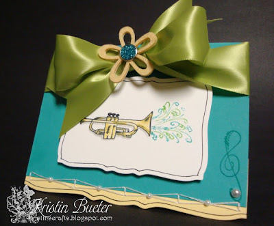
I envisioned this one being elegant despite the "funkiness" of the stamp set. I challenged myself to make it fancy :O) I felt like the Bermuda Bay and Barely Banana pieces needed something to "connect" them, so I stitched a unique design. I adhered pearl rhinestones to the center of the thread where it crossed (NOT Kaisercraft pearls like the one on the right).

For the main panel, I used my black marker to outline the image while it was still snuggled tight in the nestie. EASY, QUICK impact :O) I colored the trumpet using the same method I did on the first card. I used Crushed Curry to darken the shaded areas and added a shadow with Going Gray ink. I really like how simple the main image is. I could have added a ton of different embellishments, but I wanted it clean. That gorgeous ribbon with the flower are eye catching enough...I didn't want to lose the image entirely! No sentiment on this one, but perfect for that student who has a musical ability (whether they play the trumpet or not) or the band teacher...just to write a simple note!

...and today. I kind of like both cards! LOL I'm so indecisive this week!

Okay, that's it for over-explaining :O) Thanks for stopping by! Be sure to check out the Color Throwdown design team's creations! They are FAB!


Also, use keyword CTD60 in the online galleries and be sure to post the direct link to your creation using Mr. Linky on the CTD blog.

Hope you're having a wonderful week so far! You're half way there... :)

Saturday, September 12, 2009

My Time To Inspire Challenge...MTTI06

Wow, I can't believe it has been a week already! It's time for the Lauren's My Time to Create Saturday challenge. This week we are hosting an inspiration challenge...check out this cute inspiration piece:

So the idea is to take from the piece whatever inspires you and create a project based on that inspiration. I took the colors, naturally, because they contrast! LOVE LOVE LOVE contrast. I also took the white flowers and the brown outlined flowers on the blue bedding as inspiration. Last but not least, I was inspired by those throw pillows! LOVE them too :O)

I decided I would make an ATC this week and post the before and after pics. Here's a shot of the ATC:

And here it is made into a full card:

The most unique thing about my card (to me anyway) is that I created all of the patterned paper! I rarely create patterned paper, but I was just feeling it for this project so I let the ideas flow. I created the striped paper using my Chocolate Chip and Bliss Blue markers and a ruler. The inspiration was based on that front throw pillow.

I couldn't get that brown pillow with the thatched look out of my mind, so I went to work to replicate the design on paper. I used a 3/4" square punch and cut out the sticky part of post it notes. I positioned them on my PTI Dark Chocolate cs in a checkered pattern and used the fine tip of my Versa Mark marker to draw lines using a ruler.

Click on image to enlarge

Once I finished drawing the horizontal lines, I switched the squares and drew vertical lines.

Click on image to enlarge
I created the daisy background using PTI's Floral Frenzy stamp set, Fresh Snow ink and SU! Chocolate Chip for the centers.

Click on image to enlarge
Oh! I have to mention the popped up daisy. I don't own circle nesties, so I struggle sometimes to get the exact size circles I need. Well, for this daisy, I only have two hole punches that are within a 1/4 inch in size (the two displaying my popped up daisy). BUT, I wanted to use my three colors on this layer. What to do?! :O) I took an old circle stamp that was a little bigger than my smallest punch, and a little smaller than my largest punch and stamped chocolate chip on white cs. Result? 2 layers, plus 1 faux layer = 3 layers! Just had to share that tip :]

The rest of the card is pretty obvious, so I'll spare you the details :O) I used Mercy's Tuesday Sketch Challenge (MTSC38) for my layout. It was perfect for my ATC before and after!

Okay, so Lauren is SUPER swamped with the PTI release next week so she asked me to host today's challenge :] Speaking of which...have you seen her PTI projects this week? ULTRA cute!! She is the queen of creativity!!

If you can play along, be sure to post a link directly to your project using Mr. Linky (so that we don't have to search for it :). Also, use keyword MTTI06 in the online galleries so that everyone can view your amazing projects in one place! Oh and don't forget, you have a chance at being highlighted as one of Lauren's My Time to Shine Top 5 designers!
Hope you can play along and have fun with the inspiration piece. I have a feeling it will be one of the last "summery" type cards most of us will make this year. That's okay though because I think I'm finally ready for holiday cards. Maybe next week! You never know with me...just depends on my mood :]
Don't forget to check out the rest of the team's awesome projects! They always inspire me...each and every lady is so talented and uniquely creative in her own way! I love seeing what they come up with every Saturday... You will find links to their blogs in my left sidebar <--------

Thanks for stopping by today. Hope you have a wonderful, RELAXING weekend!!

Wednesday, September 9, 2009

Thanks for Being You

Ahh...it's hump-day already and it's my "Monday" at work :O) Gotta love a weekend that is longer than your work week! This is the life...if only it was the norm. Anywho...being Wednesday means another awesome Color Throwdown challenge (CTD59)!! This week we bring you some great autumn colors and adorable images from our sponsor, All That Scraps.

I used CC Designs, Swiss Pixies' Pippi stamp! Isn't she the CUTEST?! I have lots of ideas for her! Okay, so lets get down to business...I know, I know. What's with all the orange? Especially considering orange and I avoid each other like the plague. Well...it just so happens that I came across these two orange patterned papers and they fit the bill (...err...card) perfectly. So, I went with them! Oh, and I don't own Pumpkin Pie so I used Dusty Durango on Pippi. If you can't tell, I used the watercoloring with markers technique. I colored the wings very lightly with Soft Sky, and thought about making them sparkly, but I really liked how they turned out looking almost "clear". That was the look I was going for so I left well enough alone!

Oh...let me explain my sentiment. I couldn't decide which sentiment to use with Pippi, so I picked up an Inkadinkado stamp set at Michaels today that had this cute font and a perfect sentiment. I can't say I'm the biggest fan of Inkadinkado...I love their designs, but I struggle to get a clean image when I ink it up. I'm not sure if I need to do something to the stamp first and then ink it or what, but mine rarely comes out clean. So, with this sentiment I carefully went over the 'broken' letters with my Ruby Red marker. Hence, the dark and light areas...

Last but not least, I saw a GORGEOUS card that Mercy Kerin made when I was perusing the SCS gallery the other day. Well...this led me to a brand new challenge blog - Crazy 4 Challenges - that provided the sketch that Mercy used. This is the very FIRST challenge the new blog has offered (C4C1)! You MUST check it out if you haven't already. The ladies who joined forces to create this team are VERY well known in the papercrafting community and offer some AMAZING eye candy! I just know this blog is going to be a hit! They already have 46 entries since Saturday! AWESOME, huh? Anywho, just thought I would share what promises to become a swift fave :)

Don't forget to check out the ultra-talented CTD design team's projects! They're sure to WOW you!!!

Thanks for stopping by! Hope you have a short week like me :O)

Sunday, September 6, 2009

Happily Ever After

I made a card this morning for a couple who is getting married in two weeks. I used Mercy's Tuesday Sketch Challenge (MTSC37) for the layout (LOVE LOVE LOVE Mercy's sketches!!! Do yourself a favor and check them out!!).

The flowers and sentiment are from Papertrey Ink's Everyday Classics set (not available for purchase...this was a FREE set they sent me early this year! Read here for details on how to receive their FREE set next year.)

I stamped the flower nine times and cut out the three layers for my three flowers (yes, my fingers hurt! LOL). I'm trying to find ways to prepare different elements of my card in my family room when possible. This allows me to spend time with my husband...and my 15 year old daughter if she graces us with her presence, and less time hidden in my craft room. That being said, I cut the flowers while watching tv with my husband last night :) Two birds...one stone!


I used dimensionals to make my floral layers pop, and added pearl rhinestones to the centers (to match the pearl brad on my bow).

The patterned paper is from PTI's Green Tea Leaves set. I used an overall monochromatic Ocean Tides color palette. I wanted untraditional colors as far as wedding cards go...I think I achieved that with the Ocean Tides :)

When I pierced my bow through the tag on my card, it went in tilted like this and I really liked the way it looked so I went with it! The connectors were exposed also, so I trimmed them with wire cutters. I adhered the tag using glue dots (they seem to stick better than the normal adhesive on an embossed layer).

Here's a quick tutorial on this very simple bow. I can't take credit for the technique, I found it on Nichole Heady's blog months ago.

Step 1: Take a section of ribbon and cross it over to resemble the ribbon magnets you see on car bumpers.


Step 2: Pinch the top middle of the loop down to where the ribbon crosses and trim from spool...leaving a little excess to work with later.

Step 3: Use craft thread to tie the center of the ribbon in a knot. Trim excess thread and turn bow over.

Step 4: Use a brad large enough to encase the center of the bow. Open connectors and pinch closed around bow, covering craft thread.

Step 5: Finished! Use on cardstock by piercing through the paper or trimming brad connectors using wire cutters and adhering with dimensionals or hot glue.

Thanks for checking in! Hope you're finding craft time like me :O) Have a SAFE weekend!